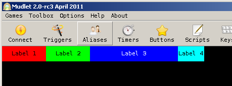
Difference between revisions of "Manual:Geyser"
| Line 715: | Line 715: | ||
{{note}} available in Mudlet 4.10+ | {{note}} available in Mudlet 4.10+ | ||
| − | You can create a right click menu for a label just by using the function (assuming your label name is 'myLabel') | + | You can create a right click menu for a label just by using the function (assuming your label name is 'myLabel'): |
| − | <syntaxhighlight lang="lua"> myLabelːcreateRightClickMenu(MenuItems = menuTable) -- scroll down for a fuller example with more details </syntaxhighlight> | + | <syntaxhighlight lang="lua"> myLabelːcreateRightClickMenu({MenuItems = menuTable}) -- scroll down for a fuller example with more details </syntaxhighlight> |
The menu table comprises of all the items and their names. To create a parent menu just create a nested table of names. | The menu table comprises of all the items and their names. To create a parent menu just create a nested table of names. | ||
| − | Example of a menuTable | + | |
| + | Example of a menuTable: | ||
<syntaxhighlight lang="lua"> menuTable = {"First Item", "Second Item (Parent)",{"First ChildItem","Second ChildItem"}, "Third Item"} </syntaxhighlight> | <syntaxhighlight lang="lua"> menuTable = {"First Item", "Second Item (Parent)",{"First ChildItem","Second ChildItem"}, "Third Item"} </syntaxhighlight> | ||
| − | + | ||
| + | The menu would look like thisː | ||
[[File:RCDemo1.gif|250px]] | [[File:RCDemo1.gif|250px]] | ||
| + | |||
| + | You can give more constraints to further style and enhance your right click menu. | ||
==== Style your right click menu ==== | ==== Style your right click menu ==== | ||
Your right click menu has 2 default styles integratedː "light" and "dark" which are defined by the constraint "Style". | Your right click menu has 2 default styles integratedː "light" and "dark" which are defined by the constraint "Style". | ||
| + | |||
To set a default style just give the constraint Style the preferred value, for exampleː | To set a default style just give the constraint Style the preferred value, for exampleː | ||
<syntaxhighlight lang="lua"> Style = "dark" </syntaxhighlight> | <syntaxhighlight lang="lua"> Style = "dark" </syntaxhighlight> | ||
| + | |||
To give different levels of your menu different style just add the number of the level to the constraint, for exampleː | To give different levels of your menu different style just add the number of the level to the constraint, for exampleː | ||
<syntaxhighlight lang="lua"> Style2 = "light" -- Gives the second level of your menu the "light" style</syntaxhighlight> | <syntaxhighlight lang="lua"> Style2 = "light" -- Gives the second level of your menu the "light" style</syntaxhighlight> | ||
| Line 753: | Line 759: | ||
==== Access an menu item directly ==== | ==== Access an menu item directly ==== | ||
The simplest way to access a menu item directly is by just using the function (assuming your label name is 'myLabel' and using the same MenuItems as defined above) | The simplest way to access a menu item directly is by just using the function (assuming your label name is 'myLabel' and using the same MenuItems as defined above) | ||
| + | |||
For example to change the menu item textː | For example to change the menu item textː | ||
<syntaxhighlight lang="lua"> | <syntaxhighlight lang="lua"> | ||
| Line 769: | Line 776: | ||
-- right click menu creation with custom styleheet on level2 and default "Dark" style | -- right click menu creation with custom styleheet on level2 and default "Dark" style | ||
| − | myRightClickLabel:createRightClickMenu( | + | myRightClickLabel:createRightClickMenu({ |
| − | + | MenuItems = {"Emergency", "Drink",{"ManaPotion","HealthPotion"}, "Disappear", "Cast",{"Blindness", "Blink"}}, | |
| − | + | Style = "Dark", | |
| − | + | MenuWidth2 = 80, | |
| − | + | MenuFormat1 = "c10", | |
| − | + | MenuStyle2 = [[QLabel::hover{ background-color: rgba(0,255,150,100%); color: white;} QLabel::!hover{color: brown; background-color: rgba(100,240,240,100%);} ]] | |
| − | + | }) | |
myRightClickLabel:setMenuAction("Emergency", function() | myRightClickLabel:setMenuAction("Emergency", function() | ||
| Line 781: | Line 788: | ||
send("emergency") | send("emergency") | ||
closeAllLevels(myRightClickLabel) -- this can be used to close the right click menu if clicked on this item | closeAllLevels(myRightClickLabel) -- this can be used to close the right click menu if clicked on this item | ||
| − | end) | + | end ) |
myRightClickLabel:setMenuAction("Drink.ManaPotion", function() | myRightClickLabel:setMenuAction("Drink.ManaPotion", function() | ||
cecho("<blue>Drinking my mana potion.\n") | cecho("<blue>Drinking my mana potion.\n") | ||
send("drink mp") | send("drink mp") | ||
| − | + | end ) | |
myRightClickLabel:setMenuAction("Drink.HealthPotion", function() | myRightClickLabel:setMenuAction("Drink.HealthPotion", function() | ||
Revision as of 01:42, 4 January 2023
Introduction
The Geyser Layout Manager is an object oriented framework for creating, updating and organizing GUI elements within Mudlet - it allows you to make your UI easier on Mudlet, and makes it easier for the UI to be compatible with different screen sizes.
Motivation
Mudlet makes the creation of label, miniconsoles and gauges a quick and easy thing. Mudlet provides a nice signal when window resize events happen. To help with complex window management, Geyser steps in.
Main Geyser Features
Geyser is based on traditional GUI concepts and should feel similar to using Java's Swing. The biggest difference is in how positions are specified.
- All window positions are specified relative to their container - nothing new there. However, window positions can also take on percentages and negative pixel and character values. For instance, a window could be constrained to have a height of 50% of its container and a width such that the window's right edge is always 20 characters from its container's right edge. See examples below and the demos/tests that come with Geyser.
- All windows under Geyser control are automatically resized as necessary when the main Mudlet window is resized. Once you create a window and assign it to a container, you never have to worry about positioning it again. Nonetheless, it's very easy to shift the container that a window is in, maintaining its constraints so that it resizes as needed according to the dimensions of the new container.
- Due to the container hierarchy, hiding a container window automatically hides all its contained windows too. The same for show. With clever construction and labels with callbacks, this lets one make complex GUI elements that are minimizable or maximizable or ...
- However, there is always some overhead for automation systems and Geyser is no exception. Fortunately, most of the overhead is during window creation and resize events - not things that happen frequently.
Getting pictures for your stuff
You can find good, freely-available assets for your UI here:
Constraints format
Geyser position constraints are a string composed of a number and a format type. For example, "10px" means 10 pixels, either pixels from the origin (e.g. x or y) or a value for the width or height. A negative number indicates distance from a container's right or bottom border depending on whether is a constraint for x/width or y/height, respectively. Percentages for width and height are in terms of the container's dimensions and negative values are converted to the equivalent positive value. A 100% width subwindow with an x-coordinate of 10 will have part of itself displayed outside the confines of its container. There is no hard limit on maximum window size, just as with regular Mudlet windows. If a number, n, is passed as a constraint instead of a string, it is assumed to be equivalent to "npx". Any Lua table that contains entries for x, y, width and height in the proper format can be used for Geyser constructors and setting constraints. Just like in Mudlet, 0,0 coordinates mean the top-left corner.
The following is a valid example for coordinates of a Geyser object:
{x = "20px", y = "-10c", width = "40%", height = 30}Math in Geyser
You can also use math in your Geyser constraints just to line things up just right! Want to have a label occupy full height but not the first 30 pixels? You can:
footer = Geyser.Label:new({
  name = "footer",
  x = 0, y = 30,
  width = "100%-30px",
}, main_window)
Geyser elements
The purpose of this document is to go through every Geyser element and provide practical examples on how they are used. Read it from top to bottom, preferably doing all of the examples to understand how they work!
See also: https://www.mudlet.org/geyser/files/index.html for a brief and technical overview of all elements and their functions.
Geyser.Container
An invisible, organizing object in Geyser - use it to divide your screen and position elements accordingly. See here for all of the functions that are available to you to use.
A container is also the base class - which means that everything (labels, miniconsoles and gauges) can use its functions, since everything else is at heart a container.
Creating a container
To get started with a container, here's an example that'll create a 200px border on the left side of Mudlet for you, and make a container cover all of it - so you can place other visual elements inside it:
setBorderLeft(200)
left_container = Geyser.Container:new({
  name = "left_container",    -- give it a unique name here
  x=0, y=0,                   -- have it start at the top-left corner of mudlet
  width = 200, height="100%", -- with a width of 200, and a height of the full screen, hence 100%
})
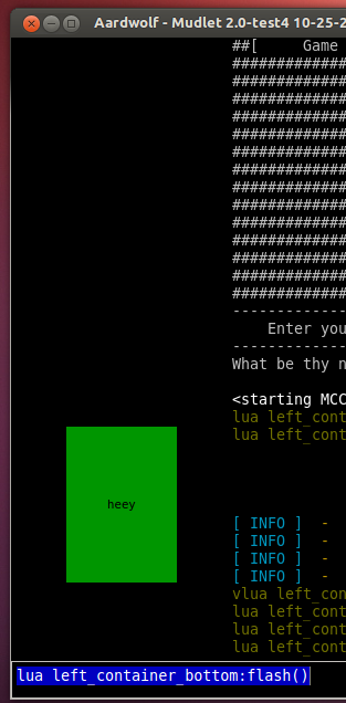
Right away, you'll see space appear on the left side. It'll be black, as the container is an invisible unit by itself. You can make sure it's there by making it flash by doing this from the input line:
lua left_container:flash()The command will cause your container to flash for a moment for you, revealing itself.
![]() Note: If you hide a container and create new Geyser elements within it, they'll be shown automatically for you.
Note: If you hide a container and create new Geyser elements within it, they'll be shown automatically for you.
Container within a container
You can place containers within other containers by specifying which "parent" the new container should have when you create one. Given our previous example, you can split the left side into two halves like this:
left_container_top = Geyser.Container:new({
  name = "left_container_top",
  x=0, y=0,                     -- this container occupies the top, so it starts top-left as well
  width = "100%", height="50%", -- but only uses up half of the height
}, left_container)              -- this is the important bit - it says that left_container_top should be inside left_container

left_container_bottom = Geyser.Container:new({
  name = "left_container_bottom",
  x=0, y="50%",                 -- this container starts halfway down the first one
  width = "100%", height="50%", -- and has the same half height of the original container
}, left_container)
Aligning relative to bottom or right sides
The aligning point within Mudlet is the top-left corner, and it's the same for the elements they are aligned - the position you specify is used by the top-left corner of the element.
Using Geyser, you can align to the opposite side as well, using the coordinates in negatives, while keeping the dimensions of the object in mind. For example, if you want to align a box that's 20px wide on the usual left side, you'd give it a width of 20 and an x value of 0. If you'd like to align it on the right side, then you'd give it an x value of -20. The box will spawn 20px away from the right side and "grow" to the right by 20px.
right_container = Geyser.Container:new({
  name = "right_container",
  x="-20%", y=0,                    -- makes the container start 20% of the screen away from the right side
  width = "20%", height="50%",      -- filling it up until the end
})
Do make sure to account for the scrollbar, as Mudlet UI elements can overlap it. You can also move the scrollbar with setBorderRight().
Geyser.Label
Labels allow you to use pictures in your interface, as well as nicely-formatted text - see docs for label functions.
Basic label
Here's an example to get you started with:
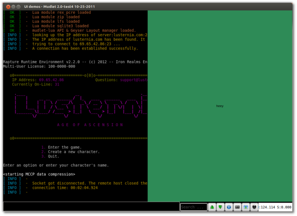
testlabel = Geyser.Label:new({
  name = "testlabel",
  x = "50%", y = 0,
  width = "50%", height = "100%",
  fgColor = "black",
  color = "SeaGreen",
  message = [[<center>heey</center>]]
})
This labels x coordinate is specified as 50% - and because it's not attached to any container, this implies that the window will start halfway at the main window. You can tell it's not attached to a container because there's nothing in between the last } and ), the place where the container goes.
The y coordinate is 0 - which means that the label will start at the top of the screen. With the width being 50%, the label will occupy 50% of the screen - and since it starts at the halfway point, it means it'll occupy the entire right side. A height of 100% means that it'll stretch from the top to the full bottom.
Here's what that'll look like:
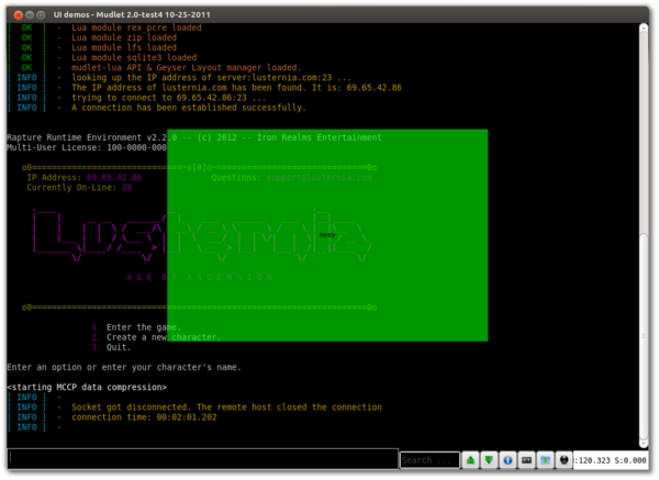
Playing around with the starting location and dimensions, we can also place it in the center of the screen with:
testlabel = Geyser.Label:new({
  name = "testlabel",
  x = "25%", y = "25%",
  width = "50%", height = "50%",
  fgColor = "black",
  message = [[<center>heey</center>]]
})
testlabel:setColor(0,255,0,150)
To change the message on a label, you can use the mylabel:echo() function, where mylabel is the name of the label you gave it:
mylabel:echo("hello!")To get rid of the label, use the :hide() function:
mylabel:hide()Coloring text
testlabel = Geyser.Label:new({
  name = "testlabel",
  x = "50%", y = 0,
  width = "50%", height = "100%",
  fgColor = "black", -- default text colour
  color = "SeaGreen" -- default label background
})

-- You can also change colour of text on demand with:
testlabel:echo[[<p style="color:blue;">You can change the text color of a whole sentence or paragraph...</p><p>...or you can change the text color of one <span style="color:green;">word</span> or even a single l<span style="color:red;">e</span>tter.</p>]]
Setting the font size
To set a different font size for your Label, use the setFontSize() method. For example:
testlabel:setFontSize(14)The font size is set in Pt, so anything above 30 will likely be too large to be useful.
Label inside a container
Once you've got your containers and mastered the basic labels, you can drop labels into your nicely-organized containers. Doing so is similar to nesting containers:
testlabel = Geyser.Label:new({
  name = "testlabel",
  x = "25%", y = "25%",
  width = "50%", height = "50%",
  fgColor = "black",
  message = [[<center>heey</center>]]
}, left_container_bottom) -- this is where we tell it what container to go into
testlabel:setColor(0,255,0,150)
That label is exactly the same as the one above that goes across the screen, except it's in our bottom-left container - so it looks appropriately different:
Image on a label
One of the more amazing things labels allow you to do is put pictures anywhere on your Mudlet screen, that blend in very well. To do so, once the label is created, use the setBackgroundImage() function with the exact path to the image (![]() ):
):
picture_label = Geyser.Label:new({
  name = "picture_label",
  x = 0, y = "-14px",
  width = "16px", height = "14px",
})
picture_label:setBackgroundImage([[/home/vadi/Desktop/skullface.png]]) -- update location to actual image location on your computer
This'll plop the picture to the bottom-left of your screen. To make the picture show, download the skullface picture above - save it to your desktop, and adjust the location of the image within [[]]'s to what it is on your computer. For example, if you saved this on your Windows 7 desktop, it would be:
picture_label:setBackgroundImage([[C:/Users/<your user name>/Desktop/skullface.png]])(yes, that's / and not \ - \ has been known not to work)
If you saved this on your Mac desktop, it would be:
picture_label:setBackgroundImage([[/Users/<your user name>/Desktop/skullface.png]])If you saved this on your Ubuntu desktop, it would be:
picture_label:setBackgroundImage([[/home/<your user name>/Desktop/skullface.png]])Using this basic building block, you can work up to making yourself a UI!
Stretching an image on a label
If you'd like your image not to keep its original size, but instead use up the available space of the label - you can use the border-image stylesheet property to do so.
label = Geyser.Label:new({
  name = "label",
  x = "50%", y = "50%",
  width = "50%", height = "50%",
})

-- change the location to your picture
-- on windows, use / to separate folders still, not \
label:setStyleSheet[[
  border-image: url(/home/vadi/Desktop/iso-avatar-draft_0.png);
]]![]() Note: If you're on a Mudlet earlier than 3.15 and are having difficulty with the image coming up, it may be because of strange differences between Qt's CSS engine which does not affect mudlet's Lua. You may want to try appending :gsub("\\","/") to your string including getMudletHomeDir() (e.g.
Note: If you're on a Mudlet earlier than 3.15 and are having difficulty with the image coming up, it may be because of strange differences between Qt's CSS engine which does not affect mudlet's Lua. You may want to try appending :gsub("\\","/") to your string including getMudletHomeDir() (e.g. getMudletHomeDir():gsub("\\","/")). No longer necessary after Mudlet 3.15.
Aligning an image within a label
You can use background-image in combination with background-position to align an image within a label (if, say, the image is much smaller than the label).
-- this will set and align an image top-right of the label
if stunning then
  mylabel:setStyleSheet([[
    background-image: url("/home/vadi/Games/Mudlet/Offensive/Artwork/dialog-ok.png");
    background-repeat: no-repeat; background-position: top right; background-origin: margin;
  ]])
else
  mylabel:setStyleSheet([[
    background-image: url("/home/vadi/Games/Mudlet/Offensive/Artwork/dialog-no.png");
    background-repeat: no-repeat; background-position: top right; background-origin: margin;
  ]])
end
Showing / hiding a label
You can show and hide labels, as you can any container, miniconsole or a gauge in Geyser with Geyser.Container:show() and Geyser.Container:hide(). Remember that since labels are a type of a container, all container functions work on them.
Hiding a label will allow you to click through on what is below the label, as well as free up the visual space for something else.
testlabel = Geyser.Label:new({
  name = "testlabel",
  x = "50%", y = 0,
  width = "50%", height = "100%",
  fgColor = "black",
  color = "SeaGreen",
  message = [[<center>heey</center>]]
})

-- hide the label with:
testlabel:hide()

-- show the label with:
testlabel:show()
Clickable images
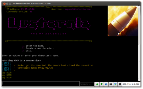
Tacking onto the fact that you can plop images anywhere on your Mudlet screen now, you can also make them react to your clicks. You can do so with the setClickCallback() function - by giving it a function to call when your label is clicked, you'll make it react.
picture_label = Geyser.Label:new({
  name = "picture_label",
  x = "-215px", y = "0px",
  width = "200px", height = "200px",
})
picture_label:setBackgroundImage([[/home/vadi/Desktop/qubodup-opengameart-cc0-200px-missile_icon.png]]) -- update location to actual image location on your computer
picture_label:setClickCallback("on_bomb_press")

function on_bomb_press()
  send("say BOOM!")
end
That's it! Pressing on the image will make the on_bomb_press() function go off, which will do its code of send("say BOOM!"). Download the picture for use here.
Styling labels
Besides putting text or images on labels, you can also style them using Qt's stylesheets feature. Doing so allows you to create various graphics that make the label look more appealing:
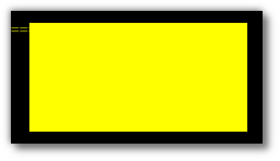
To set a stylesheet on a label, use the Geyser.Label:setStyleSheet() function on your label, describing the stylesheet you'd like to give it. A stylesheet consists of properties you set - for example the background color, borders, padding, and so forth. You describe properties in the following format: property name:values;. See here for a list of all supported properties. For example, to make your labels background be yellow, you'd use the background-color property:
mylabel = Geyser.Label:new({
  name = "mylabel",
  x = "50%", y = "50%",
  width = 200, height = 100
})

mylabel:setStyleSheet([[
  background-color: yellow;
]])
Which is nice, but not particularly impressive.
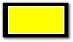
Scrolling down the list of properties, you'll come along a border one. Plopping it into our stylesheet nets the following:
mylabel:setStyleSheet([[
  background-color: yellow;
  border: 5px solid white;
]])
Which gives a border!
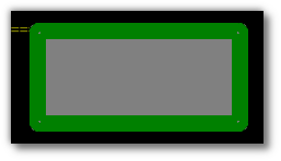
Fiddling with it some more and applying new properties we find on that page, we get a rounded border on our label:
mylabel:setStyleSheet([[
  background-color: grey;
  border-width: 15px;
  border-style: solid;
  border-color: green;
  border-radius: 10px;
]])
Which'll conclude our exploration for now. Try out all of the other possible options available there - there's loads, from funky borders, to tiling images and fancy color combinations using gradients.
You should also check out Geyser.StyleSheet for a way to manage your stylesheets with adjustable properties and the ability to take defaults from another stylesheet.
Adding a tooltip to a label
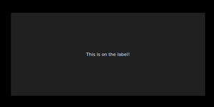
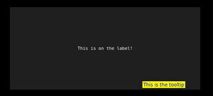
Since Mudlet 4.6, you can now add a tooltip to labels and gauges. You can start by making a simple label and echoing some text to it:
testLabel = Geyser.Label:new({
  name = "testLabel",
  x = "50%",
  y = "50%",
  height = "25%",
  width = "25%",
})
testLabel:echo("This is on the label!")
testLabel:setAlignment("center")
-- sets the tooltip text
testLabel:setToolTip("This is the tooltip", "10")


-- optionally - you can customise the tooltip, too!
testLabel:setStyleSheet("QToolTip{background: yellow; color: blue; border:none;}")
Without tooltip
With tooltip
Avoid stylesheet inheritance by tooltip
![]() Note: If you set a new stylesheet for a label and with that a background image it is possible that through inheritance the tooltip also has this stylesheet image.
Note: If you set a new stylesheet for a label and with that a background image it is possible that through inheritance the tooltip also has this stylesheet image.
To avoid this specify that the stylesheet is meant for the Label by using QLabel{...} in your Label stylesheet for exampleː
label = Geyser.Label:new({
  name = "label",
  x = "50%", y = "50%",
  width = "50%", height = "50%",
})

-- by using QLabel{...} the stylesheet won't be given to the tooltip as well
label:setStyleSheet[[
  QLabel{
  border-image: url(/home/vadi/Desktop/iso-avatar-draft_0.png);}
]]
Aligning text/images inside a label
By default, text is centered vertically and left aligned in a label. To align it to a specific side, use the stylesheets we learnt about earlier with the qproperty-alignment:
mylabel = Geyser.Label:new({
  name = "testlabel",
  x = "50%", y = 0,
  width = "50%", height = "100%",
  fgColor = "black",
  color = "SeaGreen",
  message = [[<center>heey</center>]]
})

-- specify one property this way:
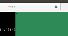
mylabel:setStyleSheet([[qproperty-alignment: 'AlignTop';]])

-- or multiple ones separated with a |, for example this will align text to top-left:
mylabel:setStyleSheet([[
  qproperty-alignment: 'AlignLeft | AlignTop';
]])

mylabel:echo("hi!")
Enabling wordwrap in a label
If you need to enable word wrapping in a label (which by default is off), add the following line to the labels stylesheet:
qproperty-wordWrap: true;
As an example:
mylabel:setStyleSheet([[
  qproperty-wordWrap: true;
]])
If you'd like to set multiple properties, set them all at once - not via multiple :setStyleSheet() calls:
mylabel:setStyleSheet([[
  background: red;
]])
Adding a hover effect to a label
The labels support adding stylesheets for specific cases, such as when a mouse is hovering over them. To make this work, you provide CSS for when the label is in its usual state, and for when it is hovered over:
-- this example will add a border to the label when it is hovered over
mylabell:setStyleSheet([[
  QLabel{ border-radius: 4px; }
  QLabel::hover{
    background-color: rgba(0,0,0,0%);
    border: 4px double green;
    border-radius: 4px;
  }
]])
Checkboxes
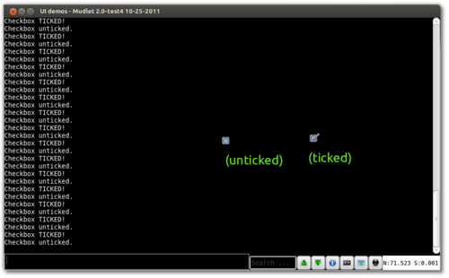
Combining the fact that you can click on a label with an image to do something with the fact that you can change pictures on a label at will, you can make an image that changes itself when you click on it.
picture_label = Geyser.Label:new({
  name = "picture_label",
  x = "50%", y = "50%",
  width = "21px", height = "19px"
})
-- a little trick we do to make the background of the label be transparent
picture_label:setStyleSheet([[
  background-color: rgba(0,0,0,0%);
]])

picture_label:setBackgroundImage([[/home/vadi/Desktop/checkbox_ticked.png]])
picture_label:setClickCallback("on_checkbox_press")

function on_checkbox_press()
  if checkbox_ticked then
    checkbox_ticked = false
    picture_label:setBackgroundImage([[/home/vadi/Desktop/checkbox_unticked.png]])
    echo("Checkbox unticked.\n")
  else
    checkbox_ticked = true
    picture_label:setBackgroundImage([[/home/vadi/Desktop/checkbox_ticked.png]])
    echo("Checkbox TICKED!\n")
  end
end
The on_checkbox_press() function this time keeps the track of the checkbox with the checkbox_ticked variable and sets the image appropriately. You can download the ticked (![]() ) and unticked images (
) and unticked images (![]() ) or the whole package altogether.
) or the whole package altogether.
Animated labels with sprites
You can animate sprite packs using timers. Assuming you have the sprite pack downloaded, try this example:
picture_label = Geyser.Label:new({
  name = "picture_label",
  x = 10, y = "-24px",
  width = "16px", height = "14px",
})

santa_counter = nil

function animate_santa()
  santa_counter = (santa_counter or 0) + 1
  if santa_counter > 8 then santa_counter = 1 end

  picture_label:setBackgroundImage([[/home/vadi/Desktop/santa/santa]]..santa_counter..[[.png]]) -- update location to actual image location on your computer
  santa_timer = tempTimer(.16, animate_santa)
end

animate_santa()
The completed package is available here, install it and do start/end animation to watch.
Inserting extra spaces and newlines
Echoing text into Mudlet and Geyser labels is different from miniconsoles and the main window, due to their nature. One of the differences is that extra spaces in a label, by default, get compressed down to one. To add extra spaces in a label, replace extra spaces with or by wrapping your text with them inside <pre>my text here</pre>.
-- this won't work, it'll show as one space:
mylabel:echo("You -> point")
-- but this would, because it replaces all spaces with   before echoing
mylabel:echo(string.gsub("You -> point", " ", " "))-- here is another way to go about this - and it additionally makes the font be monospaced:
mylabel:echo("<pre>You -> point</pre>")To add a new line in a label (aka linebreak), use <br> (instead of \n as you are used to in an echo).
mylabel:echo("These<br>words<br>are<br>split")Transparent labels
One of the possible ways of achieving transparency on a label is to add background-color: rgba(0,0,0,0%); to its stylesheet. Here's an example:
my_transparent_label:setStyleSheet([[
  background-color: rgba(0,0,0,0%);
]])
Want to get transparency in a miniconsole? You can do that as well.
Custom mouse cursor
You can change the shape of the cursor when it's over your label with:
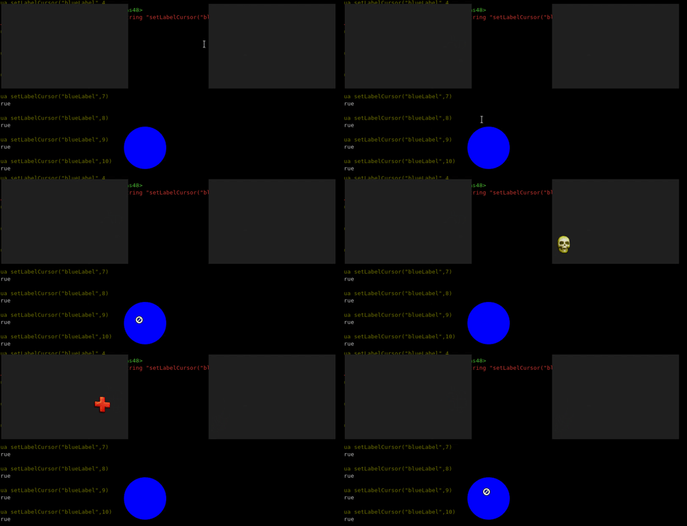
mylabel:setCursor("Forbidden") -- will change your mouse cursor to "forbidden" (as in "can't do this") cursorPossible cursor shapes are available here, and you can import this demo package to try them all out.
It is also possible to change the mouse cursor to a custom made cursor by:
mylabel:setCustomCursor(getMudletHomeDir().."/custom_cursor.png")It is recommended that the custom cursor is a png with size of 32x32 to be supported on all systems.
![]() Note: Available in Mudlet 4.8+
Note: Available in Mudlet 4.8+
Flyout Labels
Flyout labels allow you to create 'dropdown' or 'flyout' menus - menus that reveal more items once you hover your mouse over them. To create flyout labels:
- add
nestable=true(left click to open menu) ornestflyout=true(mouse hover to open menu) to your main label. - use :addChild() on your main label to add flyout labels to it.
- :addChild() uses the same arguments as when creating a new label but also takes the layoutDir option to specify in which direction and axis should the labels align, where 2 letters combine into the option: first letter R for right, L for left, T for top, B for bottom, followed by the orientation: V for vertical or H for horizontal. So options are:
layoutDir="RV",layoutDir="RH",layoutDir="LV",layoutDir="LH", and so on.
- :addChild() uses the same arguments as when creating a new label but also takes the layoutDir option to specify in which direction and axis should the labels align, where 2 letters combine into the option: first letter R for right, L for left, T for top, B for bottom, followed by the orientation: V for vertical or H for horizontal. So options are:
- optionally, add
flyOut=trueto your flyout labels to make the labels dissapear when the mouse isn't hovering over them anymore.
Note that the main flyout label cannot go into a container and needs to be on its own.
![]() Note: Requires Mudlet 3.0.
Note: Requires Mudlet 3.0.
Demo
Here's an example that follows the steps above:
label0 = Geyser.Label:new({name="label0",
  x="50%",y="50%",height=50,width=300,nestable=true,
  message="<center>Clicky clicky</center>"})

-- and add 3 labels to it with RV layout - so Right of the label, aligned Vertically
label1 = label0:addChild({name="label1",height=30,width=70, layoutDir="RV", flyOut=true, message="label one"})
label1:setStyleSheet([[background-color: purple;  border-width: 2px;  border-style: solid;  border-color: blue;  border-radius: 2px;  font-size: 7pt;]])

label2 = label0:addChild({name="label2",height=30,width=70, layoutDir="RV", flyOut=true, message="label two"})
label2:setStyleSheet([[background-color: green;  border-width: 2px;  border-style: solid;  border-color: blue;  border-radius: 2px;  font-size: 7pt;]])

label3 = label0:addChild({name="label3",height=30,width=70, layoutDir="RV", flyOut=true, message="label three"})
label3:setStyleSheet([[background-color: red;  border-width: 2px;  border-style: solid;  border-color: blue;  border-radius: 2px;  font-size: 7pt;]])
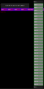
A more thorough example. Try it out to see what you can create with flyout labels:
-- create a label with a nestable=true property to say that it can nest labels
mainlabel = Geyser.Label:new({name="testa", x=400,y=50,height=50,width=300,nestflyout=true, message="<center>HOVER HERE TO SEE FLY-OUT LABELS!</center>"})

-- create 15 labels and store them in a table
table_for_flyout_labels = {}
for i=1,15 do
  -- options to layoutDir are the direction the window should go (R for right, L for left, T for top, B for bottom), followed by how the nested labels should be oriented (V for vertical or H for horizontal). So "BH" here means it'll go on the bottom of the label, while expanding horizontally
  table_for_flyout_labels[i] = mainlabel:addChild({name="test"..tostring(i),height=30,width=70, layoutDir="BH", flyOut=true, message="test"..tostring(i)})

  table_for_flyout_labels[i]:setStyleSheet([[background-color: purple;  border-width: 2px;  border-style: solid;  border-color: blue;  border-radius: 2px;]])
end

-- make the test5 label look a bit special as it has got a surprise
table_for_flyout_labels[5]:echo("Hover here")

-- add even more nested labels to the 5th label!
even_more_flyout_labels = {}
for i=1,60 do
  -- here, the layout will be to the right of it, while expanding vertically
  even_more_flyout_labels[i]=table_for_flyout_labels[5]:addChild({name="hover label "..tostring(i),height=30,width=100, layoutDir="RV", flyOut=true, message="label "..tostring(i)})
  even_more_flyout_labels[i]:setClickCallback("testFunc", even_more_flyout_labels[i].name)
  even_more_flyout_labels[i]:setStyleSheet([[background-color: grey;   border-width: 2px;  border-style: solid;   border-color: green;  border-width: 2px;  font-size: 7pt;]])
end

function testFunc(name)
  display(name)
end
It'll look something like this:
Demo of layouts
Here's another demo that explains all of the layout styles quite well:
local directions = {"R", "L", "T", "B"}
local orientations = {"V", "H"}
local mappings = {R = "right", L = "left", T = "top", B = "bottom", V = "vertical", H = "horizontal"}

local combinations, combination_labels = {}, {}
for _, direction in pairs(directions) do
  for _, orientation in pairs(orientations) do
    combinations[#combinations+1] = direction..orientation
  end
end

local function get_foreground_text_colour(r,g,b)
  local luminosity = (0.2126 * ((r/255)^2.2)) + (0.7152 * ((g/255)^2.2)) + (0.0722 * ((b  /255)^2.2))
  if luminosity > 0.5 then
    return "black"
  else
    return "white"
  end
end

local function get_random_colour_rgb()
  return math.random(1,255), math.random(1,255), math.random(1,255)
end

-- create a label with a nestable=true property to say that it can nest labels
all_possible_combinations_label = Geyser.Label:new({name="all_possible_combinations_label", x=0,y="-400",height=50,width=500,
  nestable = true, message="<center>Click to see a listing of possible combinations</center>"})

for i = 1, #combinations do
  local combination = combinations[i]
  combination_labels[i] = all_possible_combinations_label:addChild({name="combo_"..combination,height=30,width=150, nestable = true, flyOut=true, layoutDir="BH", message="<center>Combination "..combination.."</center>"})

  local r,g,b = get_random_colour_rgb()
  local text_colour = get_foreground_text_colour(r,g,b)

  local combination_labels_children = {}
  for ii = 1, 3 do
    combination_labels_children[ii] = combination_labels[i]:addChild({
      name="combo_"..combination.."_"..ii, height = 30, width = 150, layoutDir=combination, flyOut = true,
        message = string.format("<center><b>%s</b>%s+<b>%s</b>%s layout</center>",
        combination:sub(1,1), mappings[combination:sub(1,1)]:sub(2), combination:sub(2,2), mappings[combination:sub(2,2)]:sub(2)),
      fgColor = text_colour})

    combination_labels_children[ii]:setStyleSheet(string.format([[background-color:rgb(%d, %d, %d); border-width: 2px; border-style: solid; border-color: green; border-width: 2px; font-size: 7pt;]], r,g,b))
  end
end
It'll look like this:
![]() Note: available in Mudlet 4.10+
Note: available in Mudlet 4.10+
You can create a right click menu for a label just by using the function (assuming your label name is 'myLabel'):
myLabelːcreateRightClickMenu({MenuItems = menuTable}) -- scroll down for a fuller example with more detailsThe menu table comprises of all the items and their names. To create a parent menu just create a nested table of names.
Example of a menuTable:
menuTable = {"First Item", "Second Item (Parent)",{"First ChildItem","Second ChildItem"}, "Third Item"}The menu would look like thisː
You can give more constraints to further style and enhance your right click menu.
Your right click menu has 2 default styles integratedː "light" and "dark" which are defined by the constraint "Style".
To set a default style just give the constraint Style the preferred value, for exampleː
Style = "dark"To give different levels of your menu different style just add the number of the level to the constraint, for exampleː
Style2 = "light" -- Gives the second level of your menu the "light" styleFor adding your own stylesheet use the constraint MenuStyle (use the same method as above to define stylesheets for different levels)
 MenuStyle2 = [[QLabel::hover{ background-color: rgba(0,255,150,100%); color: white;} QLabel::!hover{color: brown; background-color: rgba(100,240,240,100%);} ]]
-- Gives the second level of your menu this stylesheet
The same methods are used for defining the format, width and height for the menu item.
  MenuWidth = 70 -- standard menu width if nothing else is given
  MenuWidth2 = 80 -- menu width for the second level
  MenuFormat1 = "c10" -- menu format for the first level (format works like any other label echo format, in this case c is center and 10 is the font-size)
MenuHeight = 30To set an action if your menu item is clicked use the function (assuming your label name is 'myLabel' and using the same MenuItems as defined above)
myLabelːsetMenuAction("First Item", function() echo("Clicked on the first item\n")  end
myLabelːsetMenuAction("Second Item (Parent).First ChildItem", function() echo("Clicked on the first child item\n") end) -- To set an action to a child item find it by using "Parent.Child" as name (only one parent is needed to be given the parents parent is not needed)The simplest way to access a menu item directly is by just using the function (assuming your label name is 'myLabel' and using the same MenuItems as defined above)
For example to change the menu item textː
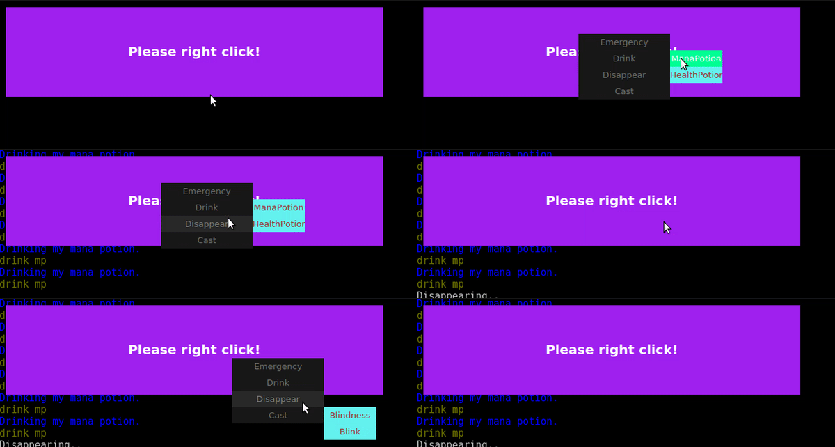
myLabelːfindMenuElement("First Item"):echo([[my first Item]])Better then any further explanation is probably this practical example.
-- create the label the right click menu will be in
myRightClickLabel = myRightClickLabel or Geyser.Label:new({
  name = "myRightClickLabel", message = "Please right click!",
  format = "cb15", x=10, y=10, width ="30%", height = "15%",
  color = "purple"})

-- right click menu creation with custom styleheet on level2 and default "Dark" style
 myRightClickLabel:createRightClickMenu({
    MenuItems = {"Emergency", "Drink",{"ManaPotion","HealthPotion"}, "Disappear", "Cast",{"Blindness", "Blink"}},
    Style = "Dark",
    MenuWidth2 = 80,
    MenuFormat1 = "c10",
    MenuStyle2 = [[QLabel::hover{ background-color: rgba(0,255,150,100%); color: white;} QLabel::!hover{color: brown; background-color: rgba(100,240,240,100%);} ]]
})

myRightClickLabel:setMenuAction("Emergency", function()
    cecho("<red:pink>[Emergency Mode] Run as fast as possible!\n")
    send("emergency")
    closeAllLevels(myRightClickLabel) -- this can be used to close the right click menu if clicked on this item
end )

myRightClickLabel:setMenuAction("Drink.ManaPotion", function()
    cecho("<blue>Drinking my mana potion.\n")
    send("drink mp")
end )

myRightClickLabel:setMenuAction("Drink.HealthPotion", function()
    cecho("<red>Drinking my health potion.\n")
    send("drink hp")
end )

myRightClickLabel:setMenuAction("Disappear", function()
    cecho("<grey>Disappearing.. \n")
    send("disappear")
    closeAllLevels(myRightClickLabel)
end )

myRightClickLabel:setMenuAction("Cast.Blindness", function()
    cecho("<light_blue>Casting blindness \n")
    send("cast blindness enemy")
    closeAllLevels(myRightClickLabel)
end )

myRightClickLabel:setMenuAction("Cast.Blink", function()
    cecho("<light_blue>Casting blink \n")
    send("cast blink")
end )
This looks likeː
If your label has an already existing left click action you'll have to create the right click menu "before" creating the labels "setClickCallBack" action and then just put into your labels onClick function (assuming your label name is 'myLabel' and 'event' is the last parameter of your onClick function)
myLabel:onRightClick(event)Geyser name
Make sure to give your Geyser Labels, miniconsoles, and userwindows a name - while it'll technically work without one, items will be duplicated when you re-save them if they're lacking a name.
Geyser.StyleSheet
Allows you to create a managed stylesheet to make it easier to set and change properties. Also allows you to inherit properties from another stylesheet, making it easier to manage multiple styles at once.
Basic Usage
Here's an example to get you started. This creates a basic stylesheet to set the background color black and the foreground/text color to green, then applies it to a Geyser Label.
local stylesheet = Geyser.StyleSheet:new([[
    background-color: black;
    color: green;
]])
local testLabel = Geyser.Label:new({
  name = "testLabel",
  x = 100,
  y = 100,
  height = 100,
  width = 300,
  stylesheet = stylesheet:getCSS(),
})

-- Alternate method of creating a stylesheet using a table of properties
local stylesheet = Geyser.StyleSheet:new({
  ['background-color'] = "black",
  ['color'] = "green",
})
Getting the CSS string
As shown above, you can use getCSS to get the stylesheet as a string.
display(stylesheet:getCSS())
--[[
"background-color: black;\ncolor: green;"
--]]
Including a target
You can include a 'target' for your stylesheet to be applied to, such as QLabel, QPlainTextEdit, etc.
-- QPlainTextEdit is useful for styling command lines in particular, to keep the style from bleeding into any associated miniconsole or userwindow.
local stylesheet = Geyser.StyleSheet:new([[
QPlainTextEdit {
    background-color: black;
    color: green;
}]])

-- or as an optional third argument. Passing nil for the parent explicitly
local stylesheet = Geyser.StyleSheet:new([[
    background-color: black;
    color: green;
]], nil, "QPlainTextEdit")

-- or using the setTarget function after the fact
local stylesheet = Geyser.StyleSheet:new([[
    background-color: black;
    color: green;
]])
stylesheet:setTarget("QPlainTextEdit")
Changing a property
Assuming you started with the example above, if you wanted to change the background color to purple you would do the following:
stylesheet:set("background-color", "purple")
testLabel:setStyleSheet(stylesheet:getCSS())
Or if you wanted to set the font, you would do:
stylesheet:set("font", [["Ubuntu Mono"]])Note the way we set the font with the double quotes included in the string, this is because the quotes have to be there in the final stylesheet. You could use single quotes instead of the bracket notation as well:
stylesheet:set("font", '"Ubuntu Mono"')Getting the value of a property
Again assuming you started with the example code above it's as easy as
stylesheet:get("color") -- will return "green"Getting a table of properties and their values
display(stylesheet:getStyleTable())
--[[
{
  ["background-color"] = "purple",
  color = "green",
  font = '"Ubuntu Mono"'
}
--]]
Setting the properties via table
stylesheet:setStyleTable({
  ["background-color"] = "purple",
  color = "green",
  font = '"Ubuntu Mono"',
})
Resetting the style with a string
Creating a new Geyser.StyleSheet would break any inheritance for stylesheets which had this one as a parent (see below), so if you wish to reset the style via CSS string you should use :setCSS
stylesheet:setCSS([[
    background-color: black;
    color: green;
    font: "Ubuntu Mono";
]])
Inheriting properties
As with most things Geyser, just pass the parent in when you create the new stylesheet
local childsheet = Geyser.StyleSheet:new("color: blue;", stylesheet)
display(childsheet:getStyleTable())
--[[
{
  ["background-color"] = "purple",
  color = "blue",
  font = '"Ubuntu Mono"'
}
--]]

display(childsheet:get("background-color")
--"purple"

-- show only properties set in this stylesheet, without inheritance
display(childsheet:getStyleTable(false))
--[[
{
  color = "blue"
}
--]]

-- can do the same for the CSS string
display(childsheet:getCSS(false))
--[[
"color: blue;"
--]]
Geyser.MiniConsole
This allows you to spawn a Mudlet miniconsole - unlike labels, these aren't as styleable, but they do format text better. They make a good fit for text-based menus, chat and map capture, and other things.
Spawning one is very similar to other Geyser elements - paste this into a new script:
HelloWorld = Geyser.MiniConsole:new({
  name="HelloWorld",
  x="70%", y="50%",
  autoWrap = true,
  color = "black",
  scrollBar = false,
  fontSize = 8,
  width="30%", height="50%",
})
This'll make you one at the bottom-right of the screen. The miniconsole will have a grey background by default, but you can set it to any color you'd like with miniconsole:setColor():
HelloWorld:setColor("black") -- give it a nice black backgroundA special dimension property that MiniConsoles have is a character - instead of specifying a miniconsole to be % of a container or a certain number of pixels, you can specify it as a certain number of characters. You do this by using "c" at the end of a number. This way, you can, for example, specify miniconsole to be 10 letters long and 2 lines high:
flatbox = Geyser.MiniConsole:new({
  name="flatbox",
  x="70%", y="50%",
  wrapAt = 10,
  width="10c", height="2c",
})
flatbox:setColor("red")
flatbox:echo("ABCDEFGHIJ") -- that is 10 letters
Adding text
You can use echo() the same way with a miniconsole to add text as to the usual window:
HelloWorld:echo("hello!")As well as cecho, decho, or hecho:
HelloWorld:cecho("<green>hey, <blue>colored <red>text!\n")Copying lines with color
To copy a line over to the miniconsole, as it is from the game with all colors preserved, you can select, copy, and append it. For an example, try making a trigger with this as the perl regex pattern type:
^That'll make the trigger go off on every line. Then give it the following script (assumed you have made the HelloWorld miniconsole from earlier):
selectCurrentLine()
copy()
HelloWorld:appendBuffer()
... and you'll see all MUD output duplicated exactly as it is to the miniconsole. Amazing! It's very efficient as well, so you can have many miniconsoles, even in spam, not lag you down.
Clearing the miniconsole
Clearing the miniconsole just requires using the following script (assumes you have made the HelloWorld miniconsole from earlier):
HelloWorld:clear()Doing edits in copied lines
Sometimes you'll want to edit the line before stuffing it into the miniconsole. For example, if you're making a chat capture, you'd want to condense a really long org name into something that's more space-friendly.
To do so, you'd use the selectString() the text you'd like to modify, replace() it with a different one:
selectString("Your", 1)  -- select the word you'd like to replace - in this case, 'Your'
setBgColor(getBgColor()) -- preserve the background color in the replacement
setFgColor(getFgColor()) -- preserve the foreground color in the replacement
replace("Mine")          -- replace the selection with the wird 'Mine'

selectCurrentLine()
copy()
HelloWorld:appendBuffer()
Gagging from the main window
If you'd like to gag the line from the main window so it only shows up in your miniconsole, delete it after moving it over:
selectCurrentLine()
copy()
HelloWorld:appendBuffer()
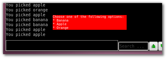
deleteLine()Using the echoLink, insertLink and setLink functions, you can turn text into one that reacts on a click. Combined with your power of placing text anywhere on the screen with a miniconsole, you can make menus with options. Here is one such example, where selecting an item causes an echo to happen:
flatbox = Geyser.MiniConsole:new({
  name="flatbox",
  x="20%", y="80%",
  width="40c", height="4c",
})
flatbox:setColor("red")
clearWindow("flatbox")

flatbox:cecho("<white:red>Choose one of the following options:\n")

flatbox:fg("white")
flatbox:bg("red")

for _, fruit in ipairs{"banana", "apple", "orange"} do
  echoLink("flatbox", "* "..fruit:title().."\n", [[echo("You picked ]]..fruit..[[\n")]], "The "..fruit.." option", true)
end

resetFormat()
This will produce something like the following:
Change your miniconsole background image
![]() Note: available in Mudlet 4.10+
Note: available in Mudlet 4.10+
To set a custom background image for your miniconsole, use :setBackgroundImage():
miniconsole_withBgImg = Geyser.MiniConsole:new({name = "BackgroundonConsole", x="50%", y="50%", width = "20%", height = "40%"})
miniconsole_withBgImg:setBackgroundImage(":/Mudlet_splashscreen_development.png", "center")

for i = 1, 6 do
  miniconsole_withBgImg:decho("<:0,0,0,130> This is a decho test with semi-transparent background\n")
end

for i = 1, 6 do
  miniconsole_withBgImg:hecho("#,80000000 This is a hecho test with semi-transparent background\n")
end

for i = 1, 2 do
  miniconsole_withBgImg:decho("<:0,0,0> This is a decho test with no transparent background\n")
end

for i = 1, 2 do
  miniconsole_withBgImg:hecho("#,000000 This is a hecho test with no transparent background\n")
end
Enable and use your miniconsole command line
![]() Note: available in Mudlet 4.10+
Note: available in Mudlet 4.10+
Every miniconsole has a hidden command line. Enable it with:
HelloWorldContainer = HelloWorldContainer or Adjustable.Container:new({name="HelloWorldContainer", titleText = "Container with a command line"})

HelloWorld = Geyser.MiniConsole:new({
  name="HelloWorld",
  x=0, y=0,
  autoWrap = true,
  color = "purple",
  scrollBar = false,
  fontSize = 8,
  width="100%", height="100%",
}, HelloWorldContainer)

HelloWorld:enableCommandLine()
Set an action to your miniconsole command line
If no action is set to your miniconsole command line the commands are send to the game the same way as for the main command line. Aliases still work as usual, and if you have command echo enabled in preferences, it'll show in both miniconsole and the main window.
It is also possible to set an action to your command line, this enables you to use the command line as custom text input.
HelloWorld:enableCommandLine()
local function channelChat(text)
  send("chat "..text)
  HelloWorld:echo("[chat] " ..text.."\n")
end

HelloWorld:setCmdAction(channelChat)
This will send your miniconsole command line input to the chat channel.
More complicated/sophisticated actions are possible, setCmdAction works the same way as the Label clickCallback functions - that is, you can pass arguments to it.
Geyser.Gauge
A Gauge allows you to represent numbers on a scale - and most typically, you've seen it be used as your standard hp/mana/whatever bar. A basic bar is made similarly to other Geyser elements. To set the value on the gauge that it should represent, use the setValue() function:
hpbar = Geyser.Gauge:new({
  name="hpbar",
  x="50%", y="85%",
  width="45%", height="5%",
})
hpbar:setValue(math.random(1,100),100)
That'll spawn you a pretty basic gauge with a horizontal orientation and a grey colour - and as a test, with a random value.
Updating a gauge
You'd want your gauge to stay in sync with your actual values. To make that happen, you want to call setValue() whenever the value that the gauge is tracking changes.
So for example, if you make a health bar - wherever you get your new health at (be it prompt, gmcp, atcp or whatever), update the gauge as well:
-- theoretical example
current_health, max_health = tonumber(matches[2]), tonumber(matches[3])

-- update the bar
hp_bar:setValue(current_health, max_health)
You can also write down how much health have you got on the bar with:
lua local hp = math.random(1,100)
hpbar:setValue(current_health, max_health, "<b>"..max_health.."hp</b>")

-- example using GMCP in IRE games:
hpbar:setValue((100/gmcp.Char.Vitals.maxhp)*gmcp.Char.Vitals.hp,100,gmcp.Char.Vitals.hp)
Styling a gauge
The Geyser gauge is composed of three labels - one is called mygauge.front, mygauge.back and mygauge.text. Combining this with Geyser:Label.setStyleSheet, you can improve the visuals of your gauges by using Qt-supported CSS. The syntax for specifying CSS is a bit different - it requires a semicolon after every property, and is done in the format of property name:values;. A list of all possible properties you can use is available here and you can use Qt Designer to create them. Practical example:
hpbar = Geyser.Gauge:new({
  name="hpbar",
  x="50%", y="85%",
  width="45%", height="20px",
})
hpbar.front:setStyleSheet([[background-color: QLinearGradient( x1: 0, y1: 0, x2: 0, y2: 1, stop: 0 #98f041, stop: 0.1 #8cf029, stop: 0.49 #66cc00, stop: 0.5 #52a300, stop: 1 #66cc00);
    border-top: 1px black solid;
    border-left: 1px black solid;
    border-bottom: 1px black solid;
    border-radius: 7;
    padding: 3px;
]])
hpbar.back:setStyleSheet([[background-color: QLinearGradient( x1: 0, y1: 0, x2: 0, y2: 1, stop: 0 #78bd33, stop: 0.1 #6ebd20, stop: 0.49 #4c9900, stop: 0.5 #387000, stop: 1 #4c9900);
    border-width: 1px;
    border-color: black;
    border-style: solid;
    border-radius: 7;
    padding: 3px;
]])

hpbar:setValue(math.random(1,100),100)
The same style can be adjusted by colors to red as well:
hpbar = Geyser.Gauge:new({
  name="hpbar",
  x="50%", y="85%",
  width="45%", height="20px",
})
hpbar.front:setStyleSheet([[background-color: QLinearGradient( x1: 0, y1: 0, x2: 0, y2: 1, stop: 0 #f04141, stop: 0.1 #ef2929, stop: 0.49 #cc0000, stop: 0.5 #a40000, stop: 1 #cc0000);
    border-top: 1px black solid;
    border-left: 1px black solid;
    border-bottom: 1px black solid;
    border-radius: 7;
    padding: 3px;]])
hpbar.back:setStyleSheet([[background-color: QLinearGradient( x1: 0, y1: 0, x2: 0, y2: 1, stop: 0 #bd3333, stop: 0.1 #bd2020, stop: 0.49 #990000, stop: 0.5 #700000, stop: 1 #990000);
    border-width: 1px;
    border-color: black;
    border-style: solid;
    border-radius: 7;
    padding: 3px;]])

hpbar:setValue(math.random(1,100),100)
Updating a gauge
The Geyser gauge is composed of three labels - one is called mygauge.front, mygauge.back and mygauge.text. To make a gauge clickable you can set a ClickCallBack on the top label which is mygauge.text example:
mygauge.text:setClickCallback("functionName", variableToSendToFunctionName)
If you would like to have different click events for the top or back of a gauge you can enable clickThrough for the top or mygauge.text label example
mygauge.text:enableClickthrough()
mygauge.front:setClickCallback("functionOne", variableToSendToFunctionOne)
mygauge.back:setClickCallback("functionTwo", variableToSendToFunctionTwo)
Tooltips on gauges
Tooltips are available since Mudlet 4.6 as explained in above section #Adding_a_tooltip_to_a_label, and as gauges are really only made up of labels as well, you could add a tooltip then by just using
mygauge.text:setToolTip("This is the gauge's tooltip", "10")the same as it's handled for clickback.
HBox/VBox
These are special types of containers. Every window in these is horizontally or vertically aligned in the order they were added.
Added to Mudlet in 2.0-rc4
Geyser.UserWindow
Allows you to use Mudlets UserWindows within Geyser, which allows you to use all the functionality of a MiniConsole in its basic form. The big advantage is the possibility to add other Geyser Elements like Labels, MiniConsole, Gauges, Mappers to the UserWindow. The UserWindow then can act as container for those elements with all the perks of dynamic resizing or any other Geyser functionality.
![]() Note: available in Mudlet 4.6.1+
Note: available in Mudlet 4.6.1+
Basic floating userwindow
This will create a movable floating userwindow.
testuserwindow = Geyser.UserWindow:new({
  name = "TestUserWindow",
  titleText ="My Test UserWindow", -- only available since Mudlet 4.8+
  x = "20%", y="20%",
  width="30%", height ="40%"
})
You can change the title of the userwindow by using the parameger titleText and the functions below (as of Mudlet 4.8+)ː
To set a new title after creation useː
testuserwindow:setTitle("My new title Text")To revert to the standard title useː
testuserwindow:resetTitle()To save the position of the userwindow - say in case you've dragged it onto another monitor and would like it to stay there when you restart Mudlet - use saveWindowLayout():
saveWindowLayout()To restore it afterwards, use loadWindowLayout():
-- create your userwindows first with Geyser.UserWindow:new
-- then restore them to the positions they were at:
loadWindowLayout()
Docked UserWindow
To create the window docked at the right side, set the variable docked (at creation of the container) to true. Be aware that with this variable set to true the position and the size at creation of the userwindow will be ignored.
testuserwindow = Geyser.UserWindow:new({
  name = "DockedTestUserWindow",
  docked = true

})
Since Mudlet 4.8+ it is also possible to choose the docking Position of the UserWindow at creation and by function withː
testuserwindow = Geyser.UserWindow:new({
  name = "DockedTestUserWindow",
  docked = true,
  dockPosition = "top" -- Possible dockPositions are left "l", right "r", top "t", bottom "b" and floating "f"
  })
To change it for a already created UserWindow use the function setDockPosition(dockPosition) likeː
testuserwindow:setDockPosition("left")Disable/enable UserWindow autoDock
![]() Note: available in Mudlet 4.8+
Note: available in Mudlet 4.8+
The auto docking feature can be really annoying at times. To disable it use the functionsː
testuserwindow:disableAutoDock() -- disables autoDock. Docking still possible with ːsetDockPosition
testuserwindow:enableAutoDock() -- reenables autoDock
Styling the UserWindow border and title area
![]() Note: available in Mudlet 4.10+ and Linux only
Note: available in Mudlet 4.10+ and Linux only
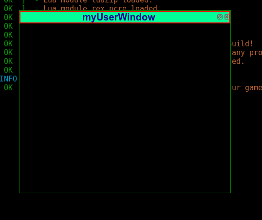
Geyser.UserWindows can accept a stylesheet to change the appearance of the border and title area and make the UserWindow look more appealing. This unfortunately only works in Linux, as in macOS and Windows, it is the OS theme that is used here.
myUserWindow = myUserWindow or Geyser.UserWindow:new({
name = "myUserWindow", titleText = "myUserWindow", autoDock = false
})

myUserWindow:setStyleSheet(
[[QDockWidget{
    border: 1px solid green;          /* UserWindow border style */
    font: bold 15pt "Arial";          /* Font of the titleBar */
    color: rgb(0,0,150);              /* Font color */
    }

    QDockWidget::title{
    background-color: rgb(0,255,150); /* TitleBar color */
    border: 2px solid red;            /* TitleBar border */
    border-radius: 2px;               /* TitleBar border radius */
    text-align: center;               /* alignment of the titleText */
    }
    ]])
This looks likeː
UserWindow as Container
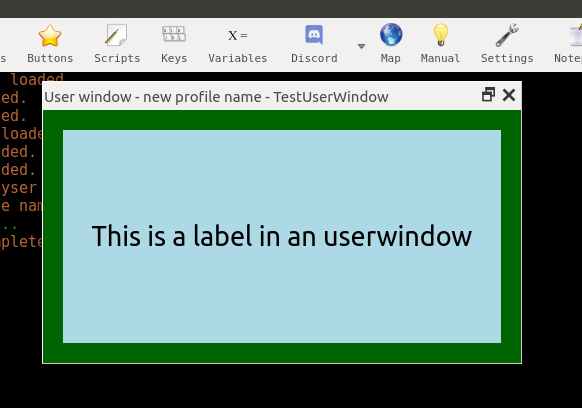
This is the feature which shows the versatile nature of Geyser.UserWindows. The UserWindow act as container and is at that possible to dynamically resize the containing Geyser Elments. Put a label in the UserWindow resize it as rectangle.
testuserwindow = Geyser.UserWindow:new({
  name = "ParentTestUserWindow",
  x = "20%", y="20%",
  width="30%", height ="40%"
})

testuserwindow:setColor("dark_green") -- give the userwindow a bit of color

labelinuserw = Geyser.Label:new({
  name = "LabelinUserWindow",
  x=20, y=20,
  width = -20, height = -20,
  color="light_blue", fontSize=20,
  },testuserwindow)

 labelinuserw:echo("This is a label in an userwindow", "black", "c")
The same way you are able to add your favorite Geyser Application (like tabbed chat, animated timers, gauges) to an UserWindow.
Note that you don't need to add MiniConsoles to a UserWindow - as UserWindows already have them built-in.
Geyser.CommandLine
![]() Note: available in Mudlet 4.10+
Note: available in Mudlet 4.10+
Allows you to create your custom command lines which can resize/move like any other Geyser object.
If you just need a command line which is integrated in a miniconsole or userwindow, check out :enableCommandLine().
Creating a Geyser.CommandLine
An example to get you startedː
myCommandLine = myCommandLine or Geyser.CommandLine:new({
  name = "myCommandLine",
  x = "-20%", y = -40,
  width = "20%", height = 40,
  stylesheet = "border: 1px solid silver;"
})
This creates a new command line in the right bottom of your screen.
Bind action to your command line input
If you use your previously created command line, any command will just be send to the game, after having been checked for aliases.
To react to any input in a custom manner, we can set an action to the command line and use the input as parameter.
Example of a command line changing the background color of your main console (assumes you have created "myCommandLine" from earlier):
myCommandLine:setAction(
function(commandLineInput)
  r, g, b = Geyser.Color.parse(commandLineInput) -- gets the r, g, b values of the color you input to the command line
  if b then -- checks if the color is valid
      setBackgroundColor(r, g, b)
  else
    echo("\n"..commandLineInput.." is not a valid color. Try again.")
  end
end)
Styling a command line
You can style your Geyser command line by using Qt-supported CSS. A list of all possible properties you can use is available here.
Practical example (assuming "myCommandLine" is created)ː
myCommandLine:setStyleSheet([[
    QPlainTextEdit{ /* QPlainTextEdit is used to prevent the styleSheet bleeding to the right click menu*/
      border: 1px solid silver;          /* Command line border style */
      background-color: rgb(0,255,150); /* Command line background color */
      font: bold 12pt "Arial";          /* Font and font-size of your command line */
      color: rgb(0,0,150);              /* Command line text color */
    }
    ]])
Create an extra command line in Mudlet
If your goal is to just have an extra command/input line - say, for role-playing purposes: copy/paste the example below into a new script in Mudletː
inputContainer = inputContainer or Adjustable.Container:new({
  x = 0, y = "-4c",
  name = "InputContainer", padding = 2,
  width = "100%", height = "4c",
  autoLoad = false
})

extraCmdLine = extraCmdLine or Geyser.CommandLine:new({
  name = "extraCmdLine",
  x = 0, y = 0, width = "100%", height = "100%"
}, inputContainer)

inputContainer:attachToBorder("bottom")
This will look likeː
Adjustable.Container
![]() Note: available in Mudlet 4.8+
Note: available in Mudlet 4.8+
Adjustable Containers are a new "GeyserClass" which act as containers for Geyser elements, but with more flexible and user configurable features. They are referred to as "adjustable" because they can be minimized, loaded, saved, moved, adjusted in size with the mouse pointer, and attached to borders.
A brief video of Introduction to Adjustable Containers is available.
Creating an Adjustable.Container
An Adjustable.Container is created just like any other Geyser Object. For example, we might experiment with creating a new Adjustable.Container by running the following line of lua code:
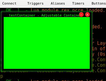
testCon = testCon or Adjustable.Container:new({name="testContainer"})This will create a new Adjustable.Container with the name testContainer. Specifying the adjustable container's name is important for saving. Defining a variable, such as testCon in our above example, allows functions to be used with the Adjustable.Container.
Our newly created Adjustable.Container may be used the same way as any other Geyser.Container might. For example, let's put a Geyser.Label in our new testContainer:
testCon = testCon or Adjustable.Container:new({name="testContainer"})
testLabel = Geyser.Label:new({name="myTestLabel", x=0, y=0, height="100%", width="100%", color="green"},testCon)
The above code creates a new, green-colored Geyser.Label in the testCon adjustable.container as shown below:
You can also create one for miniconsole:
miniconsoleContainer = miniconsoleContainer or Adjustable.Container:new({name="miniconsoleContainer"})
myMiniconsole = Geyser.MiniConsole:new({
  name="myMiniconsole",
  x=0, y=0,
  autoWrap = true,
  color = "black",
  scrollBar = false,
  fontSize = 8,
  width="100%", height="100%",
}, miniconsoleContainer)

myMiniconsole:echo("Hello!\n")
That will give you:
Key Functions
A listing of key functions for the Adjustable.Container module can be found hereː https://www.mudlet.org/geyser/files/geyser/AdjustableContainer.html
To make the Adjustable Container show on screen use the following:
testCon:show() --will cause the Adjustable Container to show if not showing Valid Constraints
Adjustable Container constraints and their default values can be found at [1].
These are in addition to the standard Geyser.Container constraints.
Change Title Text
To specify the title text of a new container, use the constraint titleText in the constructor (see valid constraints).
To change the title text after a container has already been created, use setTitle. Continuing from the previous example, the title for an existing container named "testCon" might be adjusted in a number of ways:
testCon:setTitle("Title") -- changes the container's title to "Title"A container's title text defaults to the color green, but this can also be adjusted by using setTitle:
testCon:setTitle("Red Title Test","red") -- changes the container's title text to "Red Title Test" and displays the text in the specified color "red".To restore a container's default title text, setTitle is issued without any specified title or color:
testCon:setTitle() -- resets the container's title textAutoSave and AutoLoad
The following Adjustable.Container settings can be saved and loadedː
x, y, height, width, minimized, locked, lock Style, padding, and hidden.
These settings will be automatically saved when the Mudlet profile is closed, and automatically loaded when a previous Adjustable.Container is created within the corresponding profile.
To prevent automatic saving and/or loading of these settings, the autoLoad and autoSave constraints can be included in the constructor. For example, the following code will prevent the settings of the testCon2 Adjustable.Container from being loaded upon creation:
testCon2 = testCon2 or Adjustable.Container:new({name="testCon2", autoLoad=false})To also prevent the testCon2 Adjustable.Container from automatically saving its settings when the Mudlet profile is closed, the autoSave=false constraint would be added at creation as follows:
testCont2 = testCont2 or Adjustable.Container:new({name="testCont2", autoLoad=false, autoSave=false})Automatic saving can also be deactivated after an Adjustable.Container has been created, by invoking testCont:disableAutoSave()
Note that even with autoSave and autoLoad disabled, it is still possible to save and load manually through the right-click menu and/or by using testCont:save() or testCont:load() in a script.
To save/load all your containers manually at the same time, we use Adjustable.Container:saveAll() and/or Adjustable.Container:loadAll()
"All" Functions
The following functions affect all Adjustable Containers at the same time.
![]() Note: You must create the Adjustable Containers before these functions will have an effect.
Note: You must create the Adjustable Containers before these functions will have an effect.
Adjustable.Container.loadAll() loads all the settings from your Adjustable Containers at once.
Adjustable.Container.saveAll() saves all your Adjustable Containers at once.
Adjustable.Container.loadAll() loads all the settings from your Adjustable Containers at once.
Adjustable.Container:showAll() shows all your Adjustable Containers at once.
Adjustable.Container:doAll(myfunc) creates a function that will affect all your Adjustable Containers. For example:
Adjustable.Container:doAll(function(self) self:hide() end) -- hides all your adjustable containersCustom Save/Load Directories and Slots
![]() Note: available in Mudlet 4.10+
Note: available in Mudlet 4.10+
Custom Directory
If no option set your Adjustable.Container saves/loads its settings in your profile directory.
It is possible to change the default save/load directory by using for example a different defaultDir as constraint when creating your Adjustable.Container.
![]() Note: This can be especially useful for authors of packages which want to ship their own save files.
Note: This can be especially useful for authors of packages which want to ship their own save files.
Exampleː
testCon2 = testCon2 or Adjustable.Container:new({name="testCon2", defaultDir = "/home/edru/MyAdjustableContainerSettings/"}) -- noteː the directory will be created if it doesn't existExample for save files in a package (assuming the packagename is "AdjustableContainerTest" and the settings are saved in "myPersonalAdjSettings"
local packageName = "AdjustableContainerTest"
testCon2 = testCon2 or Adjustable.Container:new({name="testCon2", defaultDir = string.format("%s/%s/myPersonalAdjSettings/", getMudletHomeDir(), packageName)})
Custom Slot
Another useful addition is to choose a save slot depending on the situation or to reset to a default save state.
To save to a different slot just add it as parameter when saving.
For exampleː
testCon2ːsave("combatSlot")To then load from that slot just useː
testCon2ːload("combatSlot")![]() Note: This also allows package/module authors to choose a "default" save setting to reset to.
Note: This also allows package/module authors to choose a "default" save setting to reset to.
Exampleː
Adjustable.ContainerːsaveAll("default") -- saves the default settings

-- to reset to default settings then just use
Adjustable.ContainerːloadAll("default") -- loads the default settings
This can also be used to change the whole GUI on the fly.
Exampleː
-- in combat situation use combat settings
Adjustable.ContainerːloadAll("combat") -- loads special combat settings
-- combat is over
Adjustable.ContainerːloadAll("default") --reverts to the default settings
Delete Save File
To delete the save file just useː
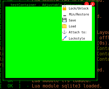
testCont2:deleteSaveFile()Your Adjustable Container has also integrated a right-click menu with the main key functions for easier usability:
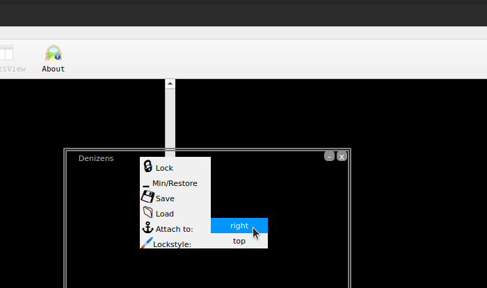
The right-click menu automatically shows you the possible positions to attach to (top, right, bottom, or left) when it's near one of them. For example, to attach a window to the right of the screen, drag it over to the right - and then the 'Attach to - right' will appear as an option:
It also shows the lockstyle selection, which allows you to choose what happens when you press Lock, with 4 lockstyles available by default:
- standard: this is the default lockstyle, with a small margin on top to keep the right click menu usable.
- light: only hides the min/restore and close labels. Borders and margin are not affected.
- full: the container gets fully locked without any margin left for the right click menu.
- border: keeps the borders of the container visible while locked.
From Mudlet 4.10+ on it is also possible to change your right-click menu style to dark mode by
myAdjustableContainer:changeMenuStyle("dark") -- possible menu styles are "dark" or "light"Create a Custom Menu with Custom Items
To create a new menu element in your right click menu called "Custom" and add an item to it use:
testcontainer:newCustomItem(name, func)
-- for example
testcontainer:newCustomItem("Hello world", function(self) echo("Hello world\n") self:flash() end)
-- this will write "Hello world" to the main console and flashes your container.
Add new LockStyles
For more advanced users it's possible to add a new Lockstyles by:
testcontainer:newLockStyle(name, func)
-- for example
testcontainer:newLockStyle("NewLockStyle", function(self) self.Inside:move(40, 40) self.Inside:resize(-40,-40) self:setTitle("") end)
Change Adjustable Container Style
Additionally to the standard container constraints Adjustable Containers allow you to change at creation: the internal Label style, the menu style, min/close buttons, the menu text, title text...
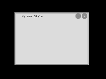
( see valid constraints) An example of a Adjustable Container with different style.
testCont =
  testCont or
  Adjustable.Container:new(
    {
      name = "TestNewStyleContainer",
      adjLabelstyle = "background-color:rgba(220,220,220,100%); border: 5px groove grey;",
      buttonstyle=[[
      QLabel{ border-radius: 7px; background-color: rgba(140,140,140,100%);}
      QLabel::hover{ background-color: rgba(160,160,160,50%);}
      ]],
      buttonFontSize = 10,
      buttonsize = 20,
      titleText = "My new Style",
      titleTxtColor = "black",
      padding = 15,
    }
  )
This code creates a container which looks like this:
Attach your Adjustable Container to a Border
The simplest way to attach your container to a border is to move your container near the border you want it to attach and use the
right click menu Attach to:
There is also the function TestCont:attachToBorder("right") -- attach TestCont to the right border
To change the margin between container and border use the constraint attachedMargin or the function TestContːsetBorderMargin(10) -- 10 is the margin in px
![]() Note: The border is set in percentages and adjusts with screen-size
Note: The border is set in percentages and adjusts with screen-size
Create a moveable border frame
![]() Note: available in Mudlet 4.10+
Note: available in Mudlet 4.10+
Adjustable Container can be connected to a border and therefore act like a frame.
This only works if your container is attached to a specific border and the border to connect to has also at least one container attached to it.
Use the function connectToBorder
TestCont:connectToBorder("left") -- possible borders are "top", "bottom", "right", "left"Minimizing automatically disconnects from a border. Another way is to use the function disconnect.
![]() Note: Connected container are still resizable even if locked.
Note: Connected container are still resizable even if locked.
If you like to do everything with your right click menu there is the function
TestContːaddConnectMenu()If you want to add the connect menu items to all Adjustable Containers just
Adjustable.Container:doAll(function(self) self:addConnectMenu() end)There is also a brief video of how to connect your Adjustable Container available.
Exampleː
GUI = GUI or {}

GUI.top = Adjustable.Container:new({name = "top", y="0%", height = "10%", autoLoad = false})
GUI.bottom = Adjustable.Container:new({name = "bottom", height = "20%", y = "-20%", autoLoad = false})
GUI.right = Adjustable.Container:new({name = "right", y = "0%", height = "100%", x = "-20%", width = "20%", autoLoad = false})
GUI.left = Adjustable.Container:new({name = "left", x = "0%", y = "0%", height = "100%", width = "20%", autoLoad = false})


GUI.top:attachToBorder("top")
GUI.bottom:attachToBorder("bottom")
GUI.left:attachToBorder("left")
GUI.right:attachToBorder("right")

GUI.top:connectToBorder("left")
GUI.top:connectToBorder("right")
GUI.bottom:connectToBorder("left")
GUI.bottom:connectToBorder("right")
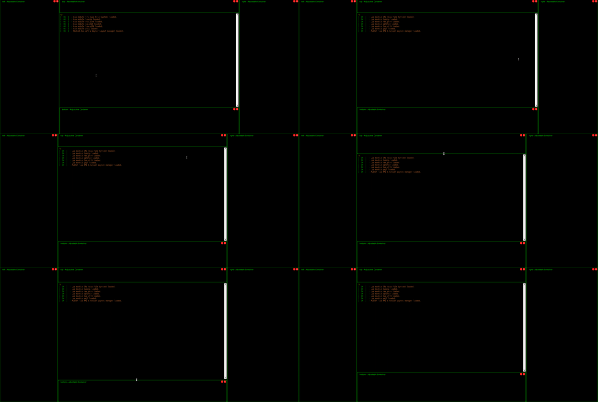
Here's what the frame will look like:
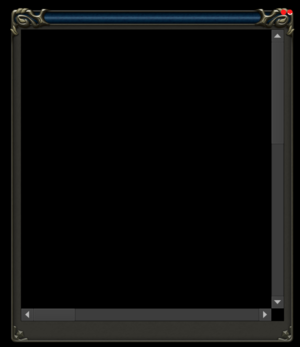
Add a scrollable box
![]() Note: available in Mudlet 4.15+
Note: available in Mudlet 4.15+
To add a scrollable box to an adjustable label, try the following:
ScrollContainer = ScrollContainer or Adjustable.Container:new({name = "ScrollContainer"})
ContainerBox = ContainerBox or Geyser.ScrollBox:new({name = "ContainerBox", x = 0, y = 0, height = "100%", width = "100%"}, ScrollContainer)
Change Container
![]() Note: available in Mudlet 4.8+
Note: available in Mudlet 4.8+
With this command it is possible to change an elements or even a containers location to that from another container. For example:
mycontainerone:changeContainer(mycontainertwo)
--puts container one into container two which means container two will be the parent of container one
It is also possible to change to a container which is not located on the main window:
myEmco:changeContainer(emco_userwindow)
--puts my tabbed chat Emco into my userwindow
--to put it back to the main window change to a container located on the main window
myEmco:changeContainer(mymainwindow_container)
--or if it the element wasn't in a container use the main Geyser Root container called Geyser
myEmco:changeContainer(Geyser)
Geyser.Mapper
![]() Note: available in Mudlet 4.8+
Note: available in Mudlet 4.8+
It‘s possible to create the mapper as a map window (similar to clicking the icon) like this:
myMapWidget = Geyser.Mapper:new({embedded= false})This will open a map window with your saved layout (if there is one, otherwise it will dock at the right corner)
To choose the position of the DockWindow at creation use: (this will create a map window docked at the left corner)
myMapWidget = Geyser.Mapper:new({embedded= false, dockPosition="left"})Possible dockPositions are "left", "right", "top", "bottom", and "floating".
To change the dockPosition after creation use:
myMapWidget:setDockPosition("floating")
-- this will change myMapWidget dockPosition to floating
Tutorial
Note: This tutorial assumes you know how scripts in Mudlet work. If not then you should look at the manual first. Also it only shows how Geyser basically works and explains Geysers special windows. It wont go into detail about the windows that where already in Mudlet.
Hello World
Let's start with something simple. A Label.
 Geyser.Label:new({
  name="HelloWorld",
  x=50, y=50,
  width=200, height=50,
})
This code creates a blank Label with a size of 200x50 at a position of 50 points horizontal and vertical from its parent window - which is the main window since we didn't specify any.
You can manipulate the Label through the normal functions but Geyser.Label:new() returns an object which can be used to manipulate the label directly. So you should store it:
 local HelloWorld = Geyser.Label:new({
  name="HelloWorld",
  x=50, y=50,
  width=200, height=50,
})
Then you can, for example print a text on it:
HelloWorld:echo("Hello World")You can put a format parameter so that the text is, for example, centered.
HelloWorld:echo("Hello World", nil, "c")The second parameter is the color. We set it to nil which means the labels foreground color will be used.
The color parameter either accepts a string ("red"), a hex value("#FF0000" or "0xFF0000" or "|cFF0000"), or a decimal value "<255,0,0>"
Example:
HelloWorld:echo("Hello World", "red", "c")![]() Note: This will automatically set the foreground color, so any echo, without the color parameter set, after that will use the same color.
Note: This will automatically set the foreground color, so any echo, without the color parameter set, after that will use the same color.
You can also set the foreground color with the setFgColor method:
HelloWorld:setFgColor("red")
HelloWorld:echo("Hello World", nil, "c")
Containers
Containers are windows that can contain other windows. Actually, since all other Geyser windows subclass container, every window can do that. But containers do not have any visible content by themselves.
Let's show that by an example:
 local container = Geyser.Container:new({
  name="container",
  x=50, y=50,
  width=250, height=50,
})
This will create a container, but if you look at the screen you will see nothing at the positon. There is a way to make containers visible though:
container:flash()This will flash the container for a short period of time.
flash() accepts a number as paremeter which defines the time, in seconds, the flash is shown.
Now, that the container is created, you can add other windows to it. There are 2 ways:
Directly when creating the window:
 local container_label = Geyser.Label:new({
  name="container_label",
  x=0, y=0,
  width="100%", height="100%",
  },
  container)
container_label:echo("This is a label in a container", nil, "c")
Later, after the window was created
 local container_label = Geyser.Label:new({
  name="container_label",
  x=0, y=0,
  width="100%", height="100%",
  })
container_label:echo("This is a label in a container", nil, "c")
container:add(container_label)
Both will lead to the same outcome.
Note that we gave a width and height of "100%" to the constructor of the label. This means that the label will take 100% of the containers width and height. If values are given in percent they will even resize with its parent:
container:resize(325, nil)The first parameter is the width, the second the height. If the value is nil the current value is used.
As said in the "Hello World" tutorial the position is relative to its parent window. That's why we could set both x and y to 0 and it is at the position we wanted - the position of the container.
When we now move the container the label moves with it:
container:move(400, nil)The first parameter is the x-, the second the y-position. If the value is nil the current value is used.
VBox and HBox
The VBox and HBox classes are special Containers. They will automatically align its containing windows vertically or horizontally, respectively, in the order they where added to them.
 local HBox = Geyser.HBox:new({
  name="HBox",
  x=0, y=0,
  width=400, height=30,
  })
Like containers you won't see them by themselves.
Adding children works like with containers
 local label1 = Geyser.Label:new({
  name="Label1",
  },
  HBox)
label1:echo("Label 1", "black", "c")
label1:setColor(255, 0, 0)
We didn't set any position or size, but the label gets the same size as the HBox.
If we add another window:
 local label2 = Geyser.Label:new({
  name="Label2",
  },
  HBox)
label2:echo("Label 2", "black", "c")
label2:setColor(0, 255, 0)
the size will be divided equally between them!
What if you want a child that takes more or less space than the others? That's possible too:
 local label3 = Geyser.Label:new({
  name="Label3",
  h_stretch_factor=2.0,
  },
  HBox)
label3:echo("Label 3", nil, "c")
label3:setColor(0, 0, 255)
As you can see, Label 3 takes the same space as Label 1 and 2 Together. That's because we supplied a horizontal stretch factor with "h_stretch_factor=2.0"
This works also with a vertical stretch factor, just replace "h_stretch_factor" with "v_stretch_factor"
Now you may have windows that should not be stretched at all. To accomplish this you have to set the horizontal and/or vertical policy:
 local label4 = Geyser.Label:new({
  name="Label4",
  width="13%",
  h_policy=Geyser.Fixed,
  },
  HBox)
label4:echo("Label 4", "black", "c")
label4:setColor(0, 255, 255)
Possible values for the policies are Geyser.Fixed and Geyser.Dynamic (which is the default). They can also be applied to VBox and HBox in exactly the same way.
Note that, like in the example above, the label will retain relative values (like percent) if used.
The VBox works like the HBox, only that the child windows are aligned vertically.
Walkthroughs
Here are a few walkthroughs that will show you how to combine Geyser elements to create some simple GUI widgets.
Create a Clickable Compass
 The following will walk you through the process of creating your own clickable compass using the Geyser framework.
Setup the image files
The compass requires a handful of images to work properly. You can find them here: https://www.dropbox.com/sh/53l7xrn4ds35wnq/WpWOziVKmH
Download each image and place it in your profile folder. You can find your profile folder with getMudletHomeDir()
If you're using Mudlet 2.1+ you can enter lua getMudletHomeDir() from the command line to return the profile folder path on your computer.
Create a new script
Script Name: compass.resize
Registered Event Handlers: sysWindowResizeEvent
Every snippet of code will be placed within this script.
Store the screen size
We'll want to store the screen size in some local variables so they can be easily referenced to later on.
local mw, mh = getMainWindowSize()Create a global table or namespace
Creating a global table will make each of your variables unique. Our namespace will be called compass and everything we make from here on out will be stored within the compass table. We'll also add a few values to it: dirs and ratio. compass.dirs will store each direction while compass.ratio will store the ratio of our screen size so you can 'square up' your compass.
compass = compass or {
  dirs = {"nw","n","ne","w","center","e","sw","s","se"},
  ratio = mw / mh
}
Create the parent label
The 'parent label' refers to the label on the bottom layer. The entire compass will be created within this label. It's container is main for it's parent is the main window.
compass.back = Geyser.Label:new({
  name = "compass.back",
  x = "25%",
  y = "25%",
  width = "10%",
  height = "10%",
},main)
Set the parent label stylesheet
This will create the blue sphere that makes up most of the compass. The background color is a radial gradient that goes from a deep blue to a brighter shade. The border radius rounds the edges. When the radius is exactly half of the label width it forms a circle. The arrows of the compass actually protrude from the sphere so we give it a margin to suck it in a bit for this effect.
compass.back:setStyleSheet([[
  background-color: QRadialGradient(cx:.3,cy:1,radius:1,stop:0 rgb(0,0,50),stop:.5 rgb(0,0,100),stop:1 rgb(0,0,255));
  border-radius: ]]..tostring(compass.back:get_width()/2-14)..[[px;
  margin: 10px;
]])
Create a 3x3 grid
The compass is split into 9 sections. One for each cardinal direction plus an extra space that sits in the center. This 3x3 grid is created by 3 VBoxes that sit within a single HBox (or vice versa but I flipped a coin and this is what it gave me).
So first off, we create the HBox. It will be the same size as its parent, compass.back.
  compass.box = Geyser.HBox:new({
    name = "compass.box",
    x = 0,
    y = 0,
    width = "100%",
    height = "100%",
  },compass.back)
Next, we create our 3 VBoxes. You don't need to specify position or size because these are placed within compass.box, an HBox.
    compass.row1 = Geyser.VBox:new({
      name = "compass.row1",
    },compass.box)
    compass.row2 = Geyser.VBox:new({
      name = "compass.row2",
    },compass.box)
    compass.row3 = Geyser.VBox:new({
      name = "compass.row3",
    },compass.box)
Finally, we add our 9 labels. Take note that they are split up into even groups of 3. Each group is placed into a different compass.row#
      compass.nw = Geyser.Label:new({
        name = "compass.nw",
      },compass.row1)

      compass.w = Geyser.Label:new({
        name = "compass.w",
      },compass.row1)

      compass.sw = Geyser.Label:new({
        name = "compass.sw",
      },compass.row1)

      compass.n = Geyser.Label:new({
        name = "compass.n",
      },compass.row2)

      compass.center = Geyser.Label:new({
        name = "compass.center",
      },compass.row2)

      compass.s = Geyser.Label:new({
        name = "compass.s",
      },compass.row2)

      compass.ne = Geyser.Label:new({
        name = "compass.ne",
      },compass.row3)

      compass.e = Geyser.Label:new({
        name = "compass.e",
      },compass.row3)

      compass.se = Geyser.Label:new({
        name = "compass.se",
      },compass.row3)
Create a callback function
We'll want our compass to head in the direction of the arrow we're clicking. This is where we specify so. When the arrow is clicked, this function will be ran with the arrow direction as the argument.
function compass.click(name)
  send(name)
end
Create the hover functions
We want our arrows to turn yellow when we hover over them. We do so by simply resetting the label's stylesheet and changing the border image. Don't forget to include the margin as we still want that.
function compass.onEnter(name)
  compass[name]:setStyleSheet([[
    border-image: url("]]..getMudletHomeDir()..[[/]]..name..[[hover.png");
    margin: 5px;
  ]])
end

function compass.onLeave(name)
  compass[name]:setStyleSheet([[
    border-image: url("]]..getMudletHomeDir()..[[/]]..name..[[.png");
    margin: 5px;
  ]])
end
Set the stylesheets in the grid
Each of the 9 labels need an image of an arrow. Rather than setting each individually, we'll iterate over the compass.dirs table we made awhile back and add the respective image to each. The names of images are a reflection of the compass.dirs table. This keeps it consistent and easy to refer to. During the iteration, the callback, setLabelOnEnter and setLabelOnLeave are also set for each label.
for k,v in pairs(compass.dirs) do
  compass[v]:setStyleSheet([[
    border-image: url("]]..getMudletHomeDir()..[[/]]..v..[[.png");
    margin: 5px;
  ]])
  compass[v]:setClickCallback("compass.click",v)
  setLabelOnEnter("compass."..v,"compass.onEnter",v)
  setLabelOnLeave("compass."..v,"compass.onLeave",v)
end
Resize the compass into a square
Most screen size ratios aren't a perfect 1:1. This will cause a 10% x 10% label to be far from square. By setting our height (the smaller of the two numbers) to our width, we can resize our compass to a near perfect square. This function is also the name of our script because we want it to run each time sysWindowResizeEvent is raised.
function compass.resize()
  compass.back:resize(compass.back.width, compass.back:get_width())
end

compass.resize()
Create a Tabbed Window
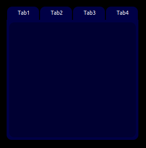 The following will walk you through the process of creating your own tabbed window using the Geyser framework.
Create a new script
Script Name: Tabbed Window
Every snippet of code will be placed within this script.
Create a global table
Creating a global table will make each of your variables unique. Our namespace will be called menu and everything we make from here on out will be stored within the menu table. We'll also add a few values to it: tabs, color1, color2, width, height and current.
'tabs' will be a table that stores all our tab names. If we want our tabs to have different names, we alter this table.
'color1' and 'color2' will store the colors of our tabbed window. If we want to change the color of our tabbed window, we alter these values.
'width' and 'height' will store the size of our tabbed window. If we want to change the size of the tabbed window, we alter these values.
'current' keeps track of which tab is selected. We will set this to the first tab in the table by default. We do this outside the initial table creation so we can easily access menu.tabs
menu = menu or {
  tabs = {"Tab1","Tab2","Tab3","Tab4"},
  color1 = "rgb(0,0,70)",
  color2 = "rgb(0,0,50)",
  width = "20%",
  height = "40%",
}
menu.current = menu.current or menu.tabs[1]
Create the main container
Our tabbed window will need a container. This will be the bottom layer. Containers are invisible so no need to set a stylesheet.
menu.container = Geyser.Container:new({
  name = "menu.back",
  x = "50%", y = "25%",
  width = menu.width,
  height = menu.height,
},main)
Create an HBox
All of our tabs will be evenly spaced. So we'll create an HBox to sit at the top of our container.
menu.header = Geyser.HBox:new({
  name = "menu.header",
  x = 0, y = 0,
  width = "100%",
  height = "10%",
},menu.container)
Create a label
This label will serve as a container for each window. It sits right underneath the HBox we just created for the tabs.
menu.footer = Geyser.Label:new({
  name = "menu.footer",
  x = 0, y = "10%",
  width = "100%",
  height = "90%",
},menu.container)
We don't want this to be a big grey box at startup, so we'll set the stylesheet to appear like the rest of the windows.
menu.footer:setStyleSheet([[
  background-color: ]]..menu.color1..[[;
  border-bottom-left-radius: 10px;
  border-bottom-right-radius: 10px;
]])
Each window actually has two labels. One for the light blue background, and another for the dark blue center. This will create that dark blue center.
menu.center = Geyser.Label:new({
  name = "menu.center",
  x = 0, y = 0,
  width = "100%",
  height = "100%",
},menu.footer)
menu.center:setStyleSheet([[
  background-color: ]]..menu.color2..[[;
  border-radius: 10px;
  margin: 5px;
]])
Add your tabs and their windows
Now we'll want to add our tabs and windows. We do this in a single for loop of the 'menu.tabs' table since it holds all our tab names.
for k,v in pairs(menu.tabs) doThis will create the tabs. Each tab will be named: menu.<tabname>tab
  menu[v.."tab"] = Geyser.Label:new({
    name = "menu."..v.."tab",
  },menu.header)
Here is where we set the tab stylesheet. Each tab has a rounded top, so we set the border-radius of the top-left and top-right to 10px. Each tab has a small space for separation so we give the right and left sides a tiny margin of 1px.
  menu[v.."tab"]:setStyleSheet([[
    background-color: ]]..menu.color1..[[;
    border-top-left-radius: 10px;
    border-top-right-radius: 10px;
    margin-right: 1px;
    margin-left: 1px;
  ]])
This will display the name of each tab on the tab.
menu[v.."tab"]:echo("<center>"..v)We need our tabs to do stuff when clicked, so we'll assign it a callback function, menu.click, which we'll create later on. Our tab name is the argument.
menu[v.."tab"]:setClickCallback("menu.click",v)Now we create the windows that appear when each tab is clicked. Each window has two labels, one atop the other. The first, which we'll create here, has rounded edges on its bottom.
  menu[v] = Geyser.Label:new({
    name = "menu."..v,
    x = 0, y = 0,
    width = "100%",
    height = "100%",
  },menu.footer)

  menu[v]:setStyleSheet([[
    background-color: ]]..menu.color1..[[;
    border-bottom-left-radius: 10px;
    border-bottom-right-radius: 10px;
  ]])
The second label serves as the window's center and has rounded edges on all sides. And a margin of 5px from it's parent, the label we just created. When adding stuff to your windows, this is the label you'll want to use. menu.<tabname>center
  menu[v.."center"] = Geyser.Label:new({
    name = "menu."..v.."center",
    x = 0, y = 0,
    width = "100%",
    height = "100%",
  },menu[v])
menu[v.."center"]:setStyleSheet([[
background-color: ]]..menu.color2..[[;
border-radius: 10px;
margin: 5px;
]])Finally, we hide all the windows and end the for loop.
  menu[v]:hide()
end
Create a callback function
The last step is to create our callback function for when a tab is clicked. This will hide that tab that is stored in menu.current, set menu.current to the clicked tab, and then show the menu.current tab.
function menu.click(tab)
  menu[menu.current]:hide()
  menu.current = tab
  menu[menu.current]:show()
end
Adding content to your windows
Add content to menu.<tab name>center
So if we wanted to display our gold in a window we could:
menu.Tab1center:echo(myGold)If we wanted to add a map to a window we could:
myMap = Geyser.Mapper:new({
  name = "myMap",
  x = 0, y = 0,
  width = "100%",
  height = "100%",
},menu.Tab2center)
Create a Window with a resize label
Previous tutorial is now done much simpler Adjustable containers, have a look at those instead.
